■ Cost Function 그리기
import numpy as np
import matplotlib.pyplot as plt
# Cost Function
# MSE : 오차제곱 평균을 구하는 함수
# w : 가중치 (초기: 임의값)
# x : 독립변수 (리스트)
# y : 종속변수 (리스트)
# b : 절편 (초기: 임의값)
def MSE(w, x, y, b):
s = 0
for i in range(len(x)): # len(x) 레코드의 개수만큼 반복
s += (y[i] - (w*x[i]+b))**2 # 오차 = (정답 - 예측값)제곱
return s / len(x)
# y = 2x + 0.1 모델 가정
x = [1., 2., 3.] # 독립변수, Feature
y = [2.1, 4.1, 6.1] # 종속변수, Label
b = 0.1
w_val = [] # weight값을 저장할 리스트 (x축)
cost_val = [] # 비용함수 오차값을 저장할 리스트 (y축)
for w in np.linspace(-4, 8, 20): # weight 값을 -4부터 8까지 20등분 (weight 값의 변화에 따른 비용 값을 만들어냄)
c = MSE(w, x, y, b)
w_val.append(w)
cost_val.append(c)
#### cost 값을 이용한 그래프 그리기
plt.plot(w_val, cost_val)
plt.xlabel('Weight')
plt.ylabel('Cost')
plt.show()
# 최적의 weight 값은 2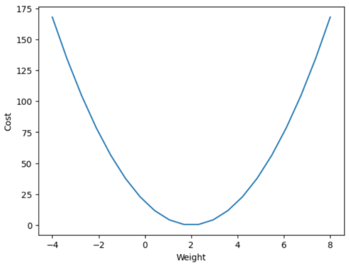
■ 가중치 학습
from sklearn.datasets import load_diabetes
import matplotlib.pyplot as plt
import numpy as np
import pandas as pd
diabetes = load_diabetes() # 당뇨병 환자 데이터 로드
print(diabetes.DESCR)
diabetes = load_diabetes() # 당뇨병 환자 데이터 로드
df = pd.DataFrame(diabetes.data, columns=diabetes.feature_names)
df.head()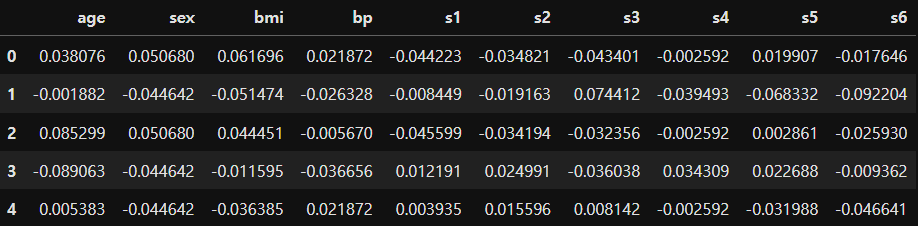
df['target'] = diabetes.target
df.head()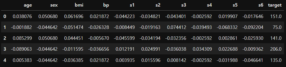
diabetes = load_diabetes() # 당뇨병 환자 데이터 로드
df = pd.DataFrame(diabetes.data, columns=diabetes.feature_names)
df['target'] = diabetes.target

w = 1.0 # 초기 가중치
b = 1.0 # 초기 절편

print(np.min(df['bmi']), np.max(df['bmi']))
# -0.09027529589850945 0.17055522598064407

pt1 = (-0.1, -0.1*w+b) # 회귀선의 시작점 (x,y)
pt2 = (0.16, 0.16*w+b) # 회귀선의 끝점 (x,y)
plt.plot([pt1[0], pt2[0]], [pt1[1], pt2[1]], 'r') # plot([x좌표 리스트], [y좌표 리스트])
plt.scatter(df['bmi'], df['target'])
plt.xlabel('BMI')
plt.ylabel('Y')
plt.show()

# 당뇨병 환자의 BMI 수치와 당뇨 수치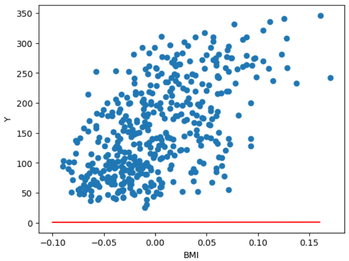
for i in range(100): # 100번 반복해서 학습
    for x_i, y_i in zip(df['bmi'], df['target']): # bmi는 x값, target은 y값
        y_hat = w*x_i + b # 예측값
        w = w - (y_hat - y_i) * x_i  # 새로운 weight = 현재 weight값 - (예측값 - y값) * x값
        b = b - (y_hat - y_i)        # 새로운 절편 = 현재 절편 - (예측값 - y값)
pt1 = (-0.1, -0.1*w+b) # 회귀선의 시작점 (x,y)
pt2 = (0.16, 0.16*w+b) # 회귀선의 끝점 (x,y)
plt.plot([pt1[0], pt2[0]], [pt1[1], pt2[1]], 'r')
plt.scatter(df['bmi'], df['target'])
plt.xlabel('BMI')
plt.ylabel('Y')
plt.show()

print('w:', w)
print('b:', b)

# w: 913.5973364346786
# b: 123.39414383177173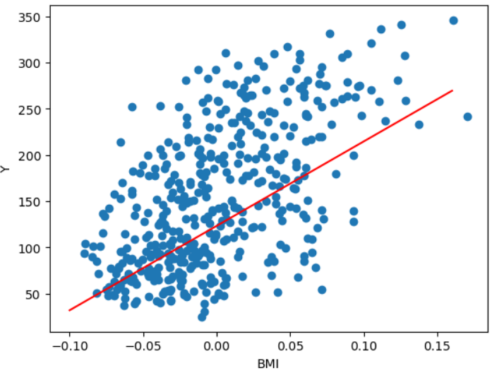
■ 단변량 데이터의 Linear Regression
- 사이킷런을 이용
- https://scikit-learn.org
scikit-learn: machine learning in Python — scikit-learn 0.16.1 documentation
scikit-learn.org
from sklearn.linear_model import LinearRegression
import numpy as np

# 1) 데이터 준비
# 독립변수는 2차원 데이터로 변경 -> [[1], [2], ...]
x = np.array([1, 3, 2, 4, 7, 4, 9, 2, 3, 2, 6, 3, 2, 7])
# (14,) -> (14,1) 행 벡터로 변환
x = np.expand_dims(x, axis=1)
# 또는 x = x.reshape(-1,1) 행의 크기는 알아서 정하고 열은 1로 지정
y = np.array([3, 9, 6, 7, 10, 6, 12, 2, 4, 3, 8, 5, 3, 10])

# 2) 모델 준비
model = LinearRegression()

# 3) 학습(fitting)
model.fit(x,y) # y = wx + b

# 4) 평가
r_square = model.score(x, y)
print('R square:', r_square)

# 5) 예측(추론)
x_new = [[7]] # 입력값은 2차원의 형태로 써줘야 함
y_hat = model.predict(x_new)
print('예측 값:', y_hat)
print('정답: 10')
R square: 0.7890969966117029
예측 값: [9.86367969]
정답: 10■ Linear Regression - 2
from sklearn.linear_model import LinearRegression
from sklearn.model_selection import train_test_split
import matplotlib.pyplot as plt
import numpy as np

# 1) 데이터 준비
np.random.seed(0)
x = np.random.rand(100, 1) * 10 # 0이상 10미만 범위의 100x1 행렬로 생성
y = (x * 2.3) + np.random.rand(100, 1) * 5.4

plt.plot(x, y, 'o')
plt.show()

# 2) 모델 준비
model = LinearRegression()

# 3) 학습 데이터와 평가 데이터 분리
x_train, x_test, y_train, y_test = train_test_split(x, y,
                                                    test_size=0.3,     # train_size=0.7
                                                    random_state = 10) # 항상 동일한 값으로 분할

# 4) 학습
model.fit(x_train, y_train)

# 5) 평가
r_square = model.score(x_test, y_test)
print(f'결정계수: {r_square:.2f}')
print('추정계수(가중치):', model.coef_)
print('절편:', model.intercept_)

# 6) 예측하고 시각화
plt.plot(x, y, 'o') # 실제값
plt.plot(x, model.predict(x), 'r') # 예측값
plt.show()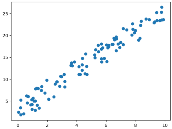
결정계수: 0.95
추정계수(가중치): [[2.21697414]]
절편: [3.30255927]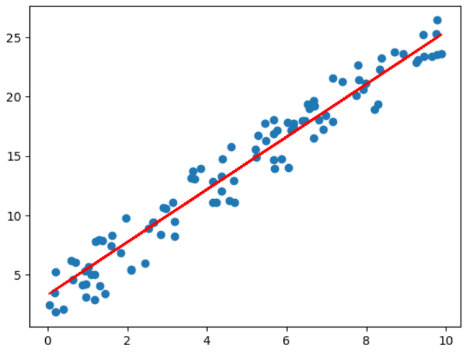
[문제] 키와 몸무게를 이용해 모델을 학습시킨 후, 키 170인 사람의 몸무게를 예측하는 프로그램을 작성하세요.
from sklearn.linear_model import LinearRegression
from sklearn.model_selection import train_test_split
from sklearn.metrics import mean_absolute_error, mean_squared_error, r2_score # MAE, MSE, R square
import numpy as np
import pandas as pd
import matplotlib.pyplot as plt


# 1) 데이터 준비
df = pd.read_csv('./Dataset/body.csv')
print(df.shape) # (1000, 3)

x = df['Height'].values.reshape(-1,1) # values는 시리즈의 값만 가져옴 (1차원 벡터) -> reshape(-1,1) 해줌으로써 2차원 배열로 변환
# x = np.expand_dims(x, axis=1)
y = df['Weight']

# 4개의 값으로 되어진 튜플의 형태로 반환
x_train, x_test, y_train, y_test = train_test_split(x, y,
                                                    train_size=0.7,     # test_size=0.3
                                                    random_state = 10)  # 항상 동일한 값으로 분할

# 2) 모델 준비
model = LinearRegression()

# 3) 학습
# 1000개의 데이터 중 700개를 가지고 가중치와 절편을 구함
model.fit(x_train, y_train)

# 4) 평가
r_square = model.score(x, y)
print('R square:', r_square)

# 5) 평가
y_hat = model.predict(x_test) # 300개의 데이터에 해당하는 예측값 300개를 만들어냄
print(f'MAE: {mean_absolute_error(y_test, y_hat):.3f}') # y_test 정답, Y_hat 예측값
print(f'r2 score: {r2_score(y_test, y_hat):.3f}') # 11%의 설명력을 가짐 (낮게 나옴)

# 5) 예측
x_new = [[170]]
y_hat = model.predict(x_new)
print('키 170.0인 사람의 예측 몸무게:', y_hat[0])

# 6) 시각화
plt.plot(x, y, 'o')
plt.plot(x, model.predict(x))
plt.show()
(1000, 3)
R square: 0.10594347384911529
MAE: 7.700
r2 score: 0.114
키 170.0인 사람의 예측 몸무게: 70.24985137688455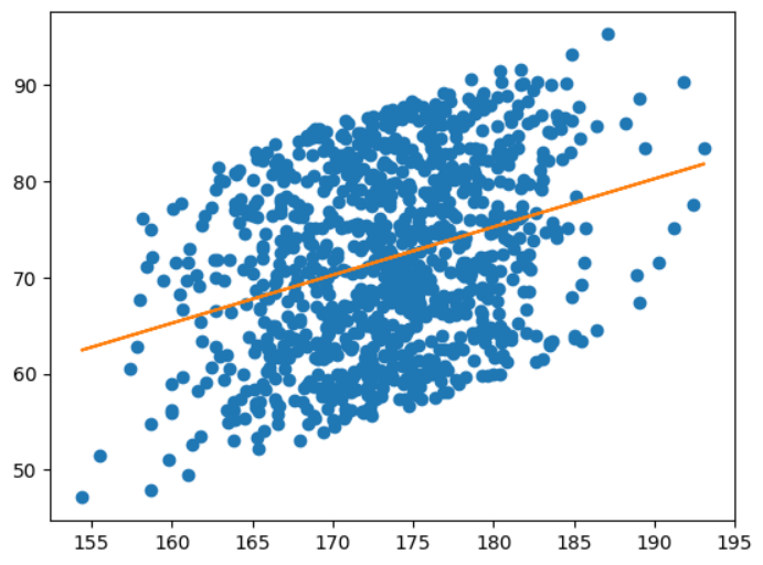
# 키 169~171 사이에 해당하는 사람의 평균 몸무게
df[df['Height'].between(169, 171)]['Weight'].mean()
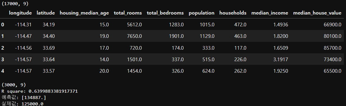
# 69.34271844660194[실습] 캘리포니아 집값 예측
- 1990년 캘리포니아 블록 그룹마다 주택 가격 데이터
from sklearn.linear_model import LinearRegression
from sklearn.ensemble import RandomForestRegressor
import numpy as np
import pandas as pd
import matplotlib.pyplot as plt
import seaborn as sns
# 1) 데이터 준비
data = pd.read_csv('./Dataset/california_housing_train.csv')
print(data.shape) # (17000, 9)
display(data.head())
x = data[data.columns[2:-1]]
y = data['median_house_value']
# 2) 모델 준비
#model = LinearRegression()
model = RandomForestRegressor()
# 3) 학습
model.fit(x, y)
# 4) 평가
test_data = pd.read_csv('./Dataset/california_housing_test.csv')
print(test_data.shape) # (3000, 9)
test_x = test_data[test_data.columns[2:-1]]
test_y = test_data['median_house_value']
print('R square:', model.score(test_x, test_y))
# 5) 예측
predict_data = test_x[10:11] # 10번째 데이터
y_hat = model.predict(predict_data)
print('예측값:', y_hat)
print('실제값:', test_y[10])
# 6) 시각화
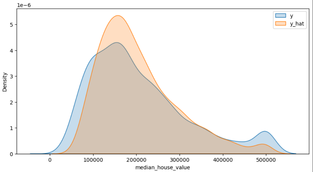
y_hat = model.predict(test_x)
plt.figure(figsize=(10,5)) # 그림의 크기 지정(inch 단위)
# 확률밀도그래프 : 히스토그램과 유사하나 각 데이터의 구간별 빈도수를 확률적으로 추정하여 부드러운 곡선으로 나타낸다 (fill 배경)
sns.kdeplot(test_y, label='y', fill=True)
sns.kdeplot(y_hat, label='y_hat', fill=True)
plt.legend() # 범례표시
plt.show()
# 3000개의 데이터에 대해서 집값 예측
'데이터 분석 > 머신러닝' 카테고리의 다른 글
| [ML] 2. 데이터 전처리 (0) | 2023.11.17 |
|---|---|
| [ML] 데이터 전처리 (0) | 2023.11.17 |
| [ML] 지도학습 알고리즘 - 회귀분석 (0) | 2023.11.15 |
| [ML] 방법론 (0) | 2023.11.15 |
| [ML] 과적합(Overfitting) (0) | 2023.11.15 |