[ML] 11. K-Means Clustering
# 데이터 로딩
from sklearn.datasets import load_iris

x, y = load_iris(return_X_y=True)
x = x[:,2:] # 꽃잎의 길이와 넓이 데이터만 추출
## 최적의 k 찾기 ##
- KMeans 클래스의 inertia 속성 사용 : 각 데이터에 할당된 클러스터의 중심까지의 제곱거리의 합계
import warnings
warnings.filterwarnings(action='ignore')
from sklearn.cluster import KMeans
import matplotlib.pyplot as plt
inertia_arr = []
k_range = range(1,10) # 군집을 1에서 9까지 늘려가면서 측정
for k in k_range:
kmeans = KMeans(n_clusters=k, random_state=10)
kmeans.fit(x) # 군집 형성
inertia_arr.append(kmeans.inertia_) # 중심까지의 제곱거리의 합을 저장
# Elbow Function 그리기
plt.plot(k_range, inertia_arr, marker='o')
plt.xlabel('Number of Clusters')
plt.ylabel('Inertia')
plt.show()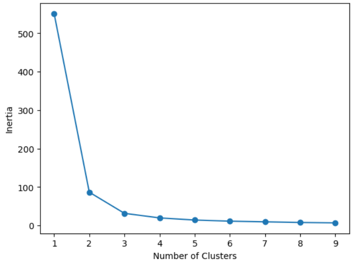
## K-Means Clustering 찾기 ##
import pandas as pd

kmeans = KMeans(n_clusters=3, random_state=10)
kmeans.fit(x)

cluster_num = kmeans.labels_
df = pd.DataFrame(x, columns=['꽃잎의 길이', '꽃잎의 넓이'])
df['class'] = y
df['cluster'] = cluster_num
df.head()
# 시각화
fig, axes = plt.subplots(1, 2, figsize=(16,8))

# 실제 정답 그래프
axes[0].scatter(x[:,0], x[:,1], c=y, s=100)
axes[0].set_title('Actual', fontsize=18)

# 군집 분석을 통해 예측한 결과 그래프
axes[1].scatter(x[:,0], x[:,1], c=cluster_num, s=100)
axes[1].set_title('Predicted', fontsize=18)

plt.show()
fig, axes = plt.subplots(1, 2, figsize=(16,8))

# 실제 정답 그래프
axes[0].scatter(x[:,0], x[:,1], c=y, s=100)
axes[0].set_title('Actual', fontsize=18)

# 군집 분석을 통해 예측한 결과 그래프
axes[1].scatter(x[:,0], x[:,1], c=cluster_num, s=100)
axes[1].set_title('Predicted', fontsize=18)

# 각 군집의 중심값
axes[1].plot(kmeans.cluster_centers_[:,0], kmeans.cluster_centers_[:,1], 'rx')

plt.show()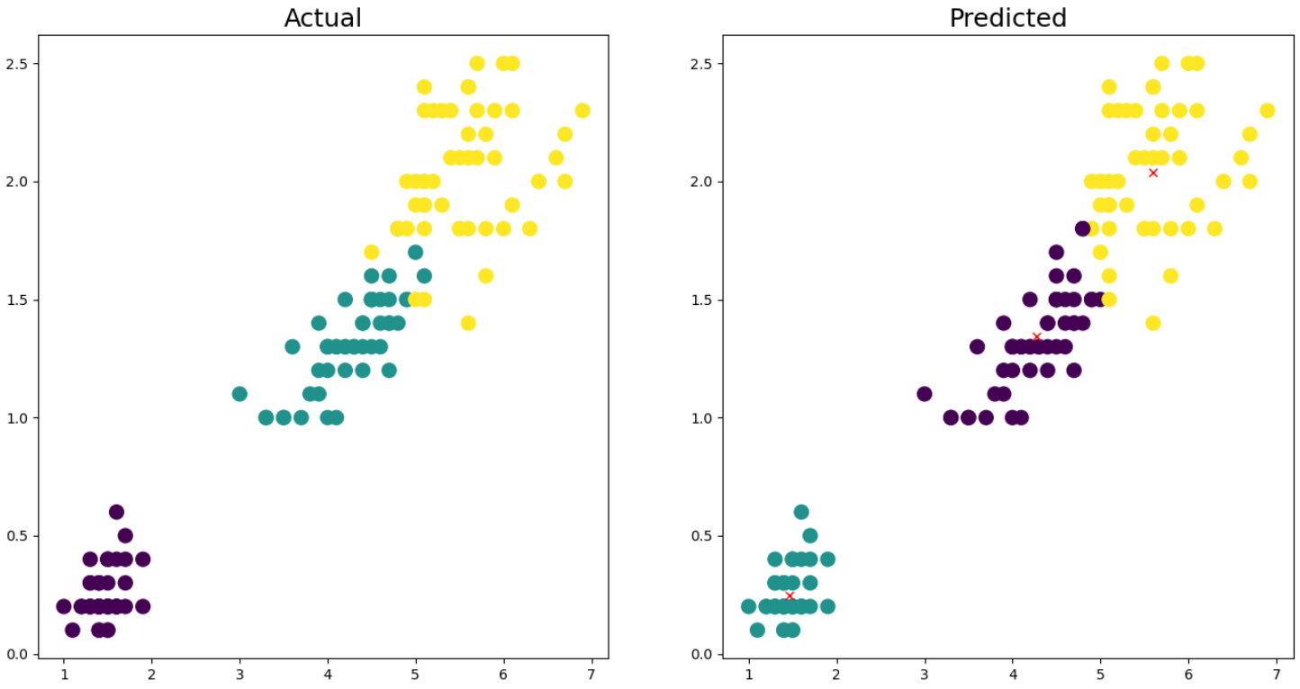
## 군집평가 ##
# 실루엣 계수를 포함한 데이터프레임 생성
from sklearn.metrics import silhouette_samples, silhouette_score
import pandas as pd

iris = load_iris()
df = pd.DataFrame(iris.data, columns=iris.feature_names)
df['cluster'] = kmeans.labels_

# iris의 모든 개별 데이터에 대한 실루엣 계수 산출
score_samples = silhouette_samples(iris.data, kmeans.labels_)
df['silhouette coef'] = score_samples

# iris의 모든 데이터의 평균 실루엣 계수 산출
avg_score = silhouette_score(iris.data, kmeans.labels_)

print(f'실루엣 계수: {avg_score:.2f}')
display(df.head())

# 클러스터별 실루엣 계수의 평균값
groub_by_cluster = df.groupby('cluster')['silhouette coef'].mean()
print(groub_by_cluster)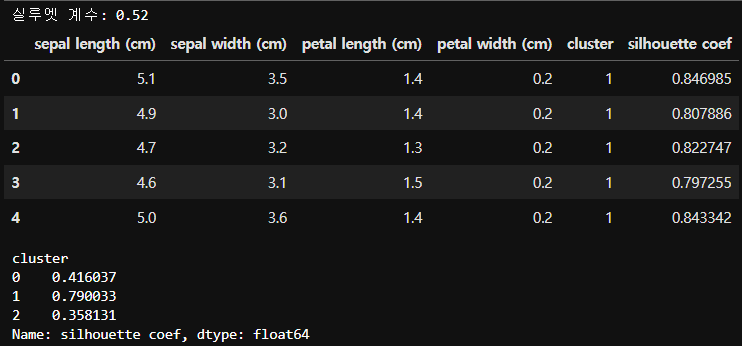
# 군집의 중심 (좌표값)
kmeans.cluster_centers_
array([[4.26923077, 1.34230769],
[1.462 , 0.246 ],
[5.59583333, 2.0375 ]])
## 실루엣 계수를 이용한 군집 개수 최적화 ##
def visualize_silhouette(cluster_lists, X_features): # 살루엣 계수를 시각화하는 함수

    from sklearn.datasets import make_blobs
    from sklearn.cluster import KMeans
    from sklearn.metrics import silhouette_samples, silhouette_score

    import matplotlib.pyplot as plt
    import matplotlib.cm as cm
    import math

    # 입력값으로 클러스터링 갯수들을 리스트로 받아서, 각 갯수별로 클러스터링을 적용하고 실루엣 개수를 구함
    n_cols = len(cluster_lists)

    # plt.subplots()으로 리스트에 기재된 클러스터링 수만큼의 sub figures를 가지는 axs 생성
    fig, axs = plt.subplots(figsize=(4*n_cols, 4), nrows=1, ncols=n_cols)

    # 리스트에 기재된 클러스터링 갯수들을 차례로 iteration 수행하면서 실루엣 개수 시각화
    for ind, n_cluster in enumerate(cluster_lists):

        # KMeans 클러스터링 수행하고, 실루엣 스코어와 개별 데이터의 실루엣 값 계산.
        clusterer = KMeans(n_clusters = n_cluster, max_iter=500, random_state=0)
        cluster_labels = clusterer.fit_predict(X_features)

        sil_avg = silhouette_score(X_features, cluster_labels)
        sil_values = silhouette_samples(X_features, cluster_labels)

        y_lower = 10
        axs[ind].set_title('Number of Cluster : '+ str(n_cluster)+'\n' \
                          'Silhouette Score :' + str(round(sil_avg,3)) )
        axs[ind].set_xlabel("The silhouette coefficient values")
        axs[ind].set_ylabel("Cluster label")
        axs[ind].set_xlim([-0.1, 1])
        axs[ind].set_ylim([0, len(X_features) + (n_cluster + 1) * 10])
        axs[ind].set_yticks([])  # Clear the yaxis labels / ticks
        axs[ind].set_xticks([0, 0.2, 0.4, 0.6, 0.8, 1])

        # 클러스터링 갯수별로 fill_betweenx( )형태의 막대 그래프 표현.
        for i in range(n_cluster):
            ith_cluster_sil_values = sil_values[cluster_labels==i]
            ith_cluster_sil_values.sort()

            size_cluster_i = ith_cluster_sil_values.shape[0]
            y_upper = y_lower + size_cluster_i

            color = cm.nipy_spectral(float(i) / n_cluster)
            axs[ind].fill_betweenx(np.arange(y_lower, y_upper), 0, ith_cluster_sil_values, \
                                facecolor=color, edgecolor=color, alpha=0.7)
            axs[ind].text(-0.05, y_lower + 0.5 * size_cluster_i, str(i))
            y_lower = y_upper + 10

        axs[ind].axvline(x=sil_avg, color="red", linestyle="--")
from sklearn.datasets import make_blobs # 클러스터링을 위한 샘플 데이터
import numpy as np
x, y = make_blobs(n_samples=500, n_features=2, centers=4, cluster_std=1, shuffle=True, random_state=1)
# centers: 생성하고자 하는 클러스터링 개수, cluster_std : 각 클러스터의 표준편차
# visualize_silhouette([2, 3, 4, 5], x)
visualize_silhouette([2, 3, 4, 5], iris.data)
# 빨간 선은 전체 데이터의 실루엣 계수의 평균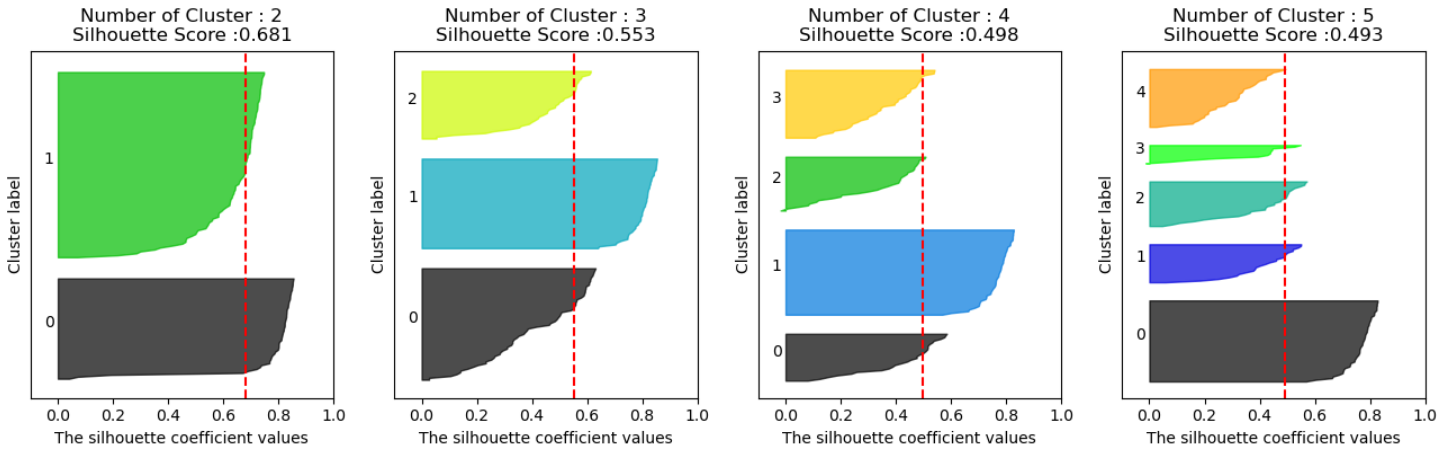
[실습] 티켓 마케팅을 위한 온라인 판매 군집분석
import pandas as pd
import numpy as np
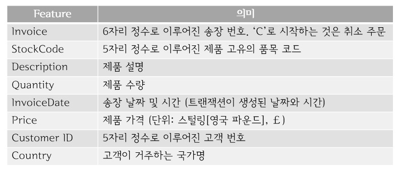
retail = pd.read_excel('./Dataset/online_retail.xlsx')
print(retail.shape) # (525461, 8)retail.head()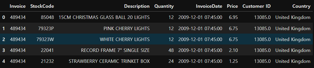
retail.info()<class 'pandas.core.frame.DataFrame'>
RangeIndex: 525461 entries, 0 to 525460
Data columns (total 8 columns):
# Column Non-Null Count Dtype
--- ------ -------------- -----
0 Invoice 525461 non-null object
1 StockCode 525461 non-null object
2 Description 522533 non-null object
3 Quantity 525461 non-null int64
4 InvoiceDate 525461 non-null datetime64[ns]
5 Price 525461 non-null float64
6 Customer ID 417534 non-null float64
7 Country 525461 non-null object
dtypes: datetime64[ns](1), float64(2), int64(1), object(4)
memory usage: 32.1+ MB
## 데이터 전처리 ##
- 결측치 확인 및 제거
retail.isna().sum()
retail = retail.dropna()
- 데이터 타입 변경
# 고객번호를 정수 타입으로 변경
retail['Customer ID'] = retail['Customer ID'].astype('int')
# 송장번호를 정수 타입으로 변경 (영문이 포함된 송장번호 존재 -> 취소 데이터)
# 정수 타입으로 변경 전 취소 데이터 삭제 필요
# 취소 주문 건수 확인
print((retail['Quantity'] < 0).sum()) # 9839건
# C가 포함된 송장번호 수 확인
print(retail['Invoice'].str.startswith('C').sum()) # 9839건
# 취소 주문 건수와 송장번호 수 동일한 것을 확인# 취소 주문 데이터 확인
retail[retail['Quantity'] < 0].head()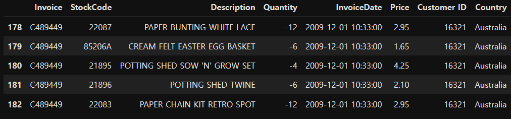
# 취소 주문건수 삭제
del_idx = retail[retail['Quantity']<0].index
retail.drop(del_idx, inplace=True)
# 송장번호를 정수 타입으로 변경
retail['Invoice'] = retail['Invoice'].astype('int')
## 분석용 데이터 준비 ##
# 주문금액 컬럼 추가
retail['OrderAmount'] = retail['Quantity'] * retail['Price']
retail.sample(10) # 랜덤하게 10개 추출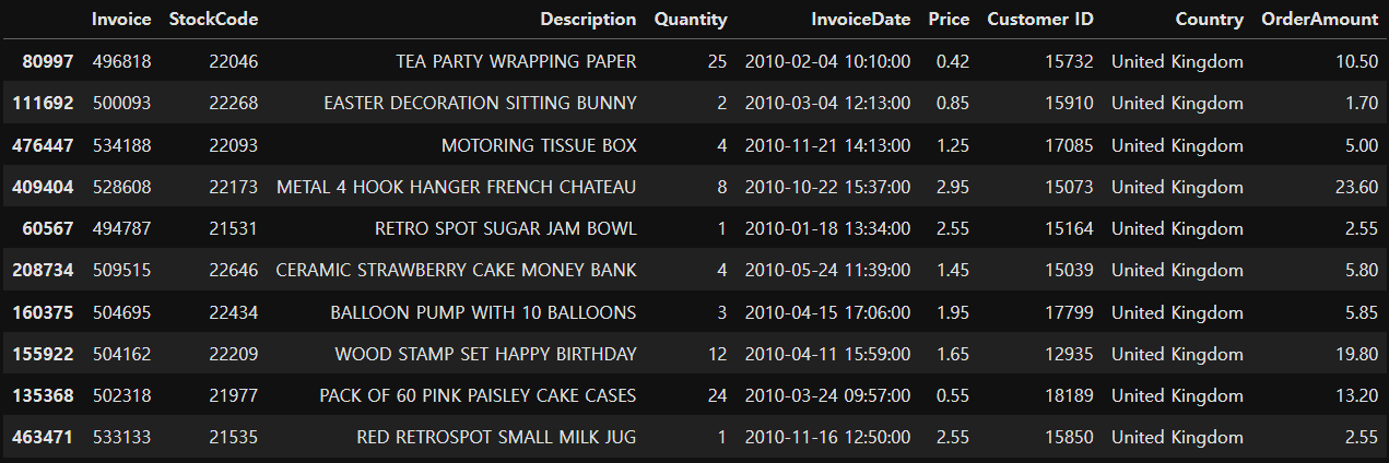
# 개별 고객 정보를 담는 데이터프레임 생성
customer_df = retail.groupby('Customer ID').agg({'Invoice':'count', 'OrderAmount':'sum', 'InvoiceDate':'max'})
print(customer_df.shape) # (4314, 3) 4314명의 고객정보 (구매횟수, 주문금액, 마지막 주문날짜)
display(customer_df.head())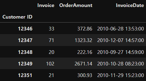
# Customer ID 인덱스를 컬럼 값으로 변경
customer_df = customer_df.reset_index()
customer_df.head()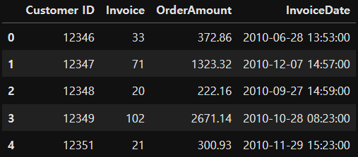
## 컬러명 변경 ##
- Invoice -> Freq (주문횟수)
- InvoiceDate -> ElapsedDays (마지막 주문일로부터 경과 일 수)
customer_df.rename(columns={'Invoice':'Freq', 'ElaspsedDays':'ElapsedDays'}, inplace=True)
customer_df.head()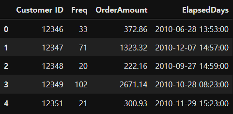
## ElapsedDays 컬럼 값 변경 ##
# 마지막 주문일로부터 기준일까지 경과된 일 수 계산
# 경과일수 = 기준일 - 마지막 구매일
# 기준일 : 2011년 9월 12일 (원본 데이터 수집 기간: 2009.1.12 ~ 2011.9.12)

customer_df['ElapsedDays'] = pd.to_datetime('2011.9.12') - customer_df['ElapsedDays']
customer_df.head()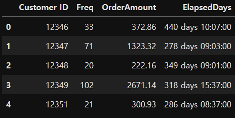
# 일수만 뽑아내기
customer_df['ElapsedDays'] = customer_df['ElapsedDays'].apply(lambda x:x.days)
customer_df.head()
## 데이터 분포 확인 ##
import matplotlib.pyplot as plt

fig, ax = plt.subplots()
ax.boxplot([customer_df['Freq'], customer_df['OrderAmount'], customer_df['ElapsedDays']], sym='bo')
plt.xticks([1,2,3], ['Freq', 'OrderAmount', 'ElapsedDays']) # 눈금의 위치와 값 지정
plt.show()
# 각 컬럼의 스케일이 다르기 때문에 분포가 잘 안보임 (데이터 분포를 고르개 보기 위해선 스케일링 필요)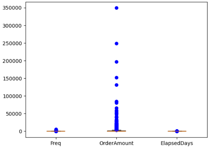
## 데이터 로그 변환 ##
- 로그를 취해주게 되면 큰 숫자를 같은 비율의 작은 숫자로 만들어 준다.
- 왜도와 첨도가 줄어들면서 정규성이 높아진다.
- 왜도(Skewness, 비대칭정도) : 평균에 대해 분포의 비대칭 정도를 나타내는 지표
- 첨도(Kurtosis, 분포의 뾰족함정도) : 관측치들이 어느정도 집중적으로 중심에 몰려있는가를 나타내는 지표
customer_df['Freq_log'] = np.log1p(customer_df['Freq'])
customer_df['OrderAmount_log'] = np.log1p(customer_df['OrderAmount'])
customer_df['ElapsedDays_log'] = np.log1p(customer_df['ElapsedDays'])
customer_df.head()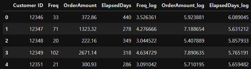
fig, ax = plt.subplots()
ax.boxplot([customer_df['Freq_log'], customer_df['OrderAmount_log'], customer_df['ElapsedDays_log']], sym='bo')
plt.xticks([1,2,3], ['Freq_log', 'OrderAmount_log', 'ElapsedDays_log']) # 눈금의 위치와 값 지정
plt.show()
# 스케일링 후 비슷한 범주로 바뀜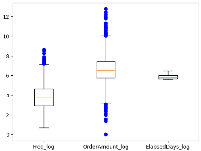
## 모델 생성 ##
- 최적의 K 찾기 - elbow function 사용
x = customer_df[['Freq_log', 'OrderAmount_log', 'ElapsedDays_log']]from sklearn.cluster import KMeans
inertia_arr = []
k_range = range(1,10) # 군집을 1에서 9까지 늘려가면서 측정
for k in k_range:
kmeans = KMeans(n_clusters=k, random_state=10)
kmeans.fit(x) # 군집 형성
inertia_arr.append(kmeans.inertia_) # 중심까지의 제곱거리의 합을 저장
# Elbow Function 그리기
plt.plot(k_range, inertia_arr, marker='o')
plt.xlabel('Number of Clusters')
plt.ylabel('Inertia')
plt.show()
# 데이터의 군집은 3개 또는 4개로 나누는 것이 좋을 것으로 보임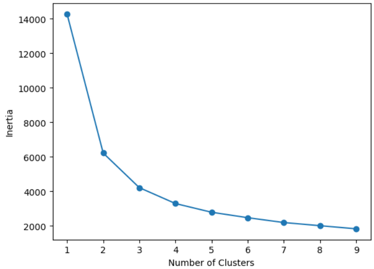
- 최적의 K 찾기 - 실루엣 계수 이용
visualize_silhouette([2, 3, 4, 5, 6], x)
# 최적의 K는 4개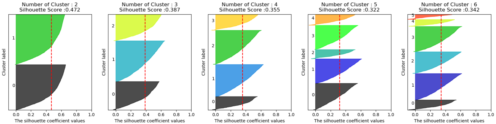
## 최적 K를 잉요한 군집분석 ##
- 최적의 K를 4로 결정
# 4개의 군집으로 분류
best_k = 4
model = KMeans(n_clusters=best_k)
model.fit(x)
cluster = model.labels_
# 군집 번호 (4개)
np.unique(cluster)
# array([0, 1, 2, 3])customer_df['cluster'] = cluster
customer_df.head()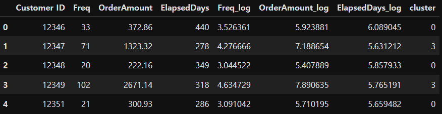
## 군집분석 결과 시각화 ##
x['cluster'] = model.labels_

for i in range(best_k): # 4개의 군집을 하나의 scatter에 그리기
    plt.scatter(x[x['cluster'] == i]['Freq_log'], x[x['cluster'] == i]['OrderAmount_log'], label='cluster-'+str(i))

plt.plot(model.cluster_centers_[:,0], model.cluster_centers_[:,1], 'bx', label='cluster center')
plt.legend()
plt.show()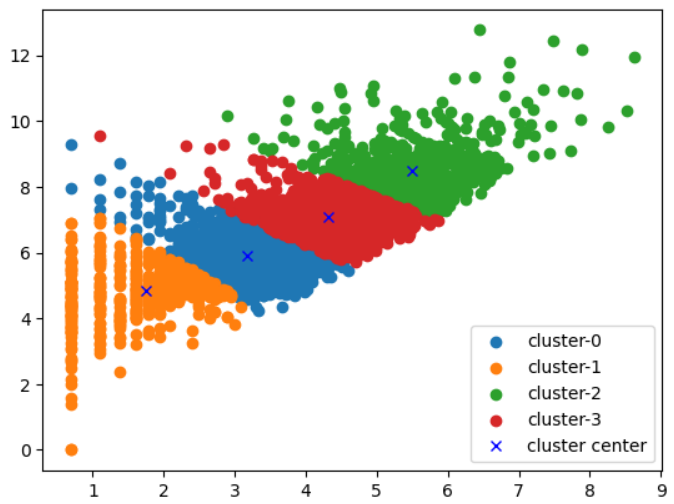
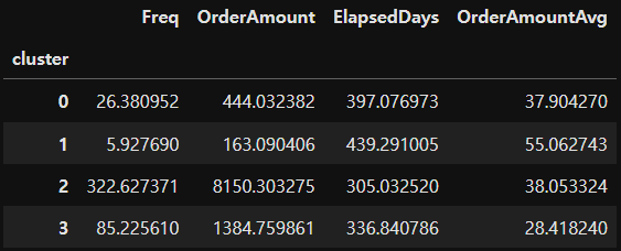
## 군집 결과 의미 해석 ##
# 실제 데이터를 가지고 군집 결과 의미 해석
customer_df_cluster = customer_df[['Freq', 'OrderAmount', 'ElapsedDays', 'cluster']]
customer_df_cluster.head()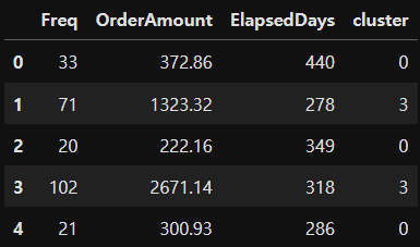
# 구매 1회당 평균 구매 비용 컬럼 추가
customer_df_cluster['OrderAmountAvg'] = customer_df_cluster['OrderAmount'] / customer_df_cluster['Freq']
customer_df_cluster.head()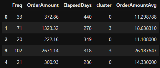
# 클러스터별 데이터프레임 생성
groupby_cluster = customer_df_cluster.groupby('cluster')
# 각 그룹별 레코드의 개수 확인
groupby_cluster['Freq'].count()cluster
0 1533
1 567
2 738
3 1476
Name: Freq, dtype: int64
# 각 그룹별 독립변수의 평균값 확인
groupby_cluster.mean()